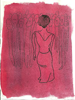
 My roomie received some weird Crayola paper and markers for Christmas - I believe they're called "Explosive Color" - because the marker reacts with the special paper in a way that makes it look extra bright, almost like poster paint. I made this weird little drawing last night, just messing around with the markers...
Sunday, December 25, 2011
A Crayola X-Mas
 My roomie received some weird Crayola paper and markers for Christmas - I believe they're called "Explosive Color" - because the marker reacts with the special paper in a way that makes it look extra bright, almost like poster paint. I made this weird little drawing last night, just messing around with the markers...
Friday, December 16, 2011
Five Easy Pieces


And below is a real Lichtenstein:
 Top drawing is various pencils and watercolor, bottom drawing is Sharpie marker and gouache. Maybe my next serious should be crying men in film...
 Sunday, September 11, 2011
TEXTures in Brooklyn!
 Last week I was delighted to show a small series of drawings in an art exhibit in Brooklyn, entitled "TEXTures," curated by my friend, and fellow artist, Molly (see her website at: http://www.mollydigrazia.com/) The show's theme centered around text in works of art, and the media ranged from drawings and paintings to sculpture, film, and photography. Here is a photo of the crowd that gathered for the one-night-only exhibition. My drawings are on the far left. Here's a closer look:
 The series I created for the show is a suite of six 6"x8" drawings based on the short film by experimental filmmaker Kenneth Anger, "Puce Moment," of 1949. The text was taken from the First Duino Elegy, a poem by Rainer Maria Rilke (originally in German). I used compositions from stills from the film and took some liberties with color, as well as simplified the whole in order to make them all the more "Becky-esque." <--new term just invented...feel free to use liberally...
For these drawings I used watercolor, Sharpie marker, pencil, and gold and silver metallic acrylic craft paint.


Monday, August 22, 2011
Monday, June 6, 2011
Singin' in the Rain
From a Poster
From Memory
 Colors always look brighter on overcast days, no? I saw this pretty combination of colors one day - sea green, dark brown, and slate blue - above the subway station, and tried to take a mental picture because it was so pretty. Then I did my best to recreate it using watercolor and pen. Turns out my picture is not very accurate, so I might try this again later...
Friday, May 20, 2011
Creepy Arm
Tuesday, May 17, 2011
Sunday, March 6, 2011
Analyze This!

Drawing #1: watercolor and Sharpie marker...it began as a still life, which I then decided was too boring, so I added the lady.
Drawing #2: um yeah, don't ask. I started by doin' a little watercolor, and then drew on top with Sharpie, but I'm not sure exactly how I arrived at such disturbing figures. The one in the middle is based on a doodle I made on the subway. Here she is in close-up:
 Ok, and finally drawing #3...
 This one is a little different. I drew on tracing paper instead of bristol paper, colored in with blue pencil and yellow highlighter, and decided not to include any figures. I like to think of it as "geometric parent-child volleyball with a brick wall in place of a net and no ball and also it's raining." Unfortunately the tracing paper is larger than my scanner so the top part got cut off. But you get the jist.
And the winner is...? Well Angel had to choose one of the three drawings to discuss in depth for his paper, and he chose Drawing #3! I kind of liked drawing under pressure, it ended up producing some pretty weird and interesting drawings!
 These are a few drawings inspired by the movie "Lost in Translation..."


 This last one looks like a Francesco Clemente rip-off, although I wasn't thinking of it at the time...all of these are watercolor and Sharpie marker, and in this last one I added red marker.


