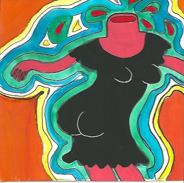
This piece was made awhile ago but I forgot to post it. Based on a scene from "Minnie and Moskowitz," the John Cassavetes film from 1971, which I saw in the theater last year. Watercolor, tempera, and pen on paper.




.jpg)
 After I took my awful Qualifying Exam in January, I went to Atlantic City to blow off some steam and forget all 2,000 of the images I had just memorized. That night, my man friend and I ended up in a casino bar with several nearly nude ladies dancing on platforms. I found them oddly fascinating, and I'm not exactly sure why, but the whole scene was very grotesquely mesmerizing in a sad and beautiful way. This painting was made in response to that evening. Partially inspired by Milton Glaser's psychadelic Dylan poster from the '60s (see below). Acrylic and metallic craft paint with Sharpie on canvas, 16x20.
 A still from a film by Stan Brakhage, "Window Water Baby Moving," an experimental short film showing the birth of Brakhage's first child in all its gory glory. Believe it or not, this still is from before the baby was born. I was lucky enough to walk in with my dinner just as the baby's head was "crowning..." Blargh! Au revoir, appetite! Anywho his films are full of rapid, jarring cuts that make you feel as if you're having a seizure. I found this still by careful pausing. Staedtler pen, watercolor, and pencil on paper.
 This is a drawing I made about a year ago after seeing the Godard film, "Vivre sa vie." It shows the scene where Anna Karina is watching the silent film about "Jeanne d'Arc" and as the woman on screen starts crying, Anna starts crying too. I included this with my drawing of Debbie Reynolds (Singing in the Rain) and Karen Black (Five Easy Pieces) in my "Women Crying" series that was in my friend Molly's exhibit two weeks ago. I will post images of the 3 together in a bit. This drawing was created with black Staedtler pigment liners on sketchbook paper.
 Hmmm...where to begin? I started drawing a figure, only having a vague idea of what I was doing. I wanted to make a weird lanky female with really long, blonde hair, and I wanted to keep the composition really simple. I decided I would use only a few colors - pale yellow for hair, pale purple for the body, and either light gray or white in the background. But somewhere along the way I turned the figure into what now appears to be a male with an incredibly long forehead wearing a sleeping bag and walking on a green pasture with the pattern of my pajama pants in the background...hmmm....I changed the colors of the arms from a dark maroon color to the current teal/blue and also added the harlequin-like diamond pattern in select areas.
  Here's a close-up of the face, which I find hilarious for some reason - such determination! Such a giant forehead! Created with Staedtler permanent marker, gouache, watercolor, pencil, and colored pencil.
 My roomie received some weird Crayola paper and markers for Christmas - I believe they're called "Explosive Color" - because the marker reacts with the special paper in a way that makes it look extra bright, almost like poster paint. I made this weird little drawing last night, just messing around with the markers...


 Top drawing is various pencils and watercolor, bottom drawing is Sharpie marker and gouache. Maybe my next serious should be crying men in film...
  Last week I was delighted to show a small series of drawings in an art exhibit in Brooklyn, entitled "TEXTures," curated by my friend, and fellow artist, Molly (see her website at: http://www.mollydigrazia.com/) The show's theme centered around text in works of art, and the media ranged from drawings and paintings to sculpture, film, and photography. Here is a photo of the crowd that gathered for the one-night-only exhibition. My drawings are on the far left. Here's a closer look:
 The series I created for the show is a suite of six 6"x8" drawings based on the short film by experimental filmmaker Kenneth Anger, "Puce Moment," of 1949. The text was taken from the First Duino Elegy, a poem by Rainer Maria Rilke (originally in German). I used compositions from stills from the film and took some liberties with color, as well as simplified the whole in order to make them all the more "Becky-esque." <--new term just invented...feel free to use liberally...


 These are a few drawings inspired by the movie "Lost in Translation..."


 This last one looks like a Francesco Clemente rip-off, although I wasn't thinking of it at the time...all of these are watercolor and Sharpie marker, and in this last one I added red marker.